

UX Collective - Medium
shared a link post in group #Product Design
uxdesign.cc
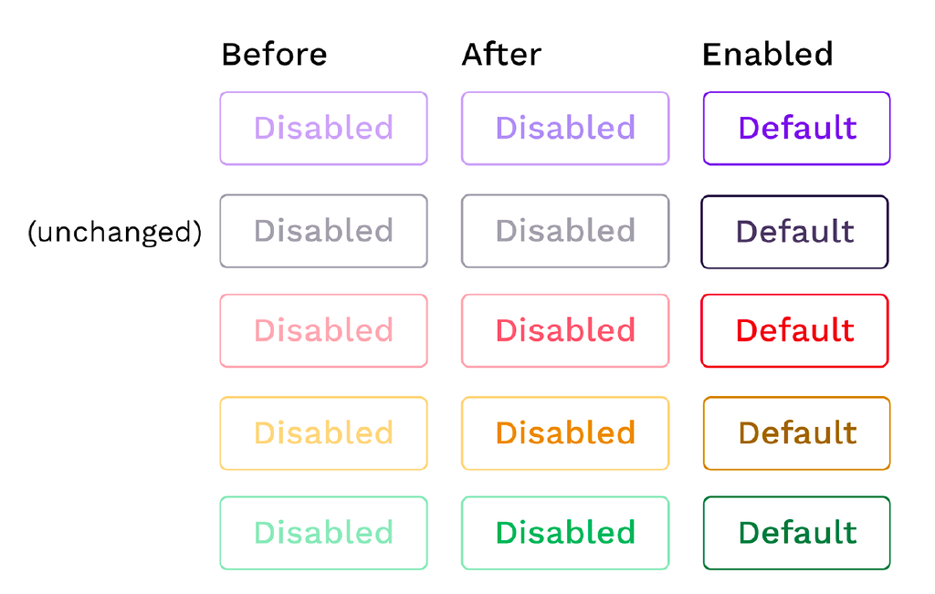
What should be the contrast level of inactive buttons?
Using the APCA Readability Criterion to improve the accessibility of disabled controls

Product Design
shared a link post in group #Product Design
uxdesign.cc
What should be the contrast level of inactive buttons?
Using the APCA Readability Criterion to improve the accessibility of disabled controls
Comment here to discuss with all recipients or tap a user's profile image to discuss privately.
<div data-postid="zpbyzkv" [...] </div>